My bus rolls into Port Authority. I’ve got 10 minutes to get across town for my first meeting. I sprint down the escalator, run through droves of people, and arrive at a subway turnstile. I swipe my MetroCard through the magnetic reader, step forward—only to get crotch-checked by a locked metal bar and flipped the finger by a screen that displays “PLEASE SWIPE AGAIN.” I give it another swipe. “INSUFFICIENT FARE.”
To refill my MetroCard, I power walk toward the kiosk. It refuses to read my credit card. I swipe a few more times. Nothing. I sift through my back pocket, discover a crumpled ten-dollar bill, and slide it into the machine. It won’t accept my cash. I waffle-iron the bill flat with my hands and feed it back in.
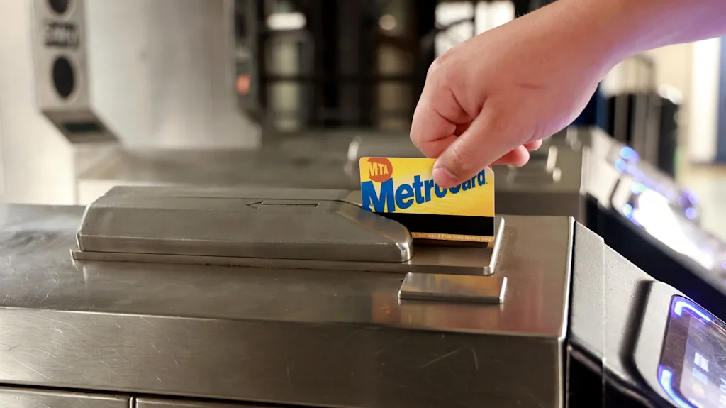
The kiosk spits out my refilled MetroCard. Baked into its awful blue and yellow design is this same awful experience, on repeat.
The MetroCard has been a defining artifact of New York City’s subway system for more than three decades. In that time, some might argue, it has become an icon of design. I respectfully disagree.
Design is inextricable from experience. The MetroCard’s design is as outdated as its technology. Fortunately, after years of poor MetroCard experiences like mine, the MTA has made its final update to the swiping technology.
In 1993, the MetroCard was introduced as a replacement for subway tokens. It existed for decades as New Yorkers’ dominant method for accessing the subway. But in 2019, the MTA announced they were introducing a tap-and-go system called OMNY. That year, they installed it on Staten Island buses and across 16 subways as part of a pilot program. Over the next four years, they installed OMNY machines throughout all five boroughs.
Manhattan and Brooklyn were early adopters. By November 2024, 60% of riders were using OMNY, according to Shanifah Rieara, the MTA’s chief customer officer. “Running two systems—with their duplicative costs—meant we had to set a certain date,” she says. But that date was continually delayed due to slow installation and technical issues with the remaining vending machines. Now, with an OMNY reader and vending machine at nearly every transit location, the MTA will say goodnight to the MetroCard. And they’ll save at least $20 million in operational costs.
A Design That Wouldn’t Go Away
The MetroCard design remained more or less the same since the ’90s. Why? “We’re wedded to the nostalgia and the brand,” says Rieara. “We had no interest in changing it.”
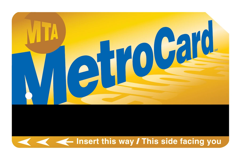
When it was redesigned in 1997, the look of the MetroCard was novel. There were new gradient and perspective tools at the designer’s disposal. Someone at the MTA had a field day: they created a glowing yellow sunset, a reflection, and a skewed MetroCard logo, which mimicked a train. This design looked fast. Riders would have expected a frictionless swiping experience, not a constant “PLEASE SWIPE AGAIN.”
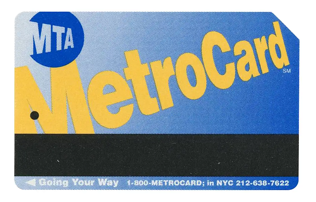
In contrast, the original MetroCard design from 1993 was less ambitious. It was also more honest. The gradient was pure utility: it directed the rider to swipe left. And that MetroCard logo? It floated in a vague 3D space. The design didn’t mimic. It didn’t overpromise.
Transit card design shouldn’t put you to sleep. In Hong Kong, they have the Octopus card, which features a dynamic yellow, green, and blue infinity loop. Paired with a small typographic Octopus logo, the card’s modernist design looks like something out of Chermayeff & Geismar & Haviv’s studio. It’s confident. And since 1997, the card’s functionality has delivered upon the design’s promise with mostly reliable tap-and-go service.
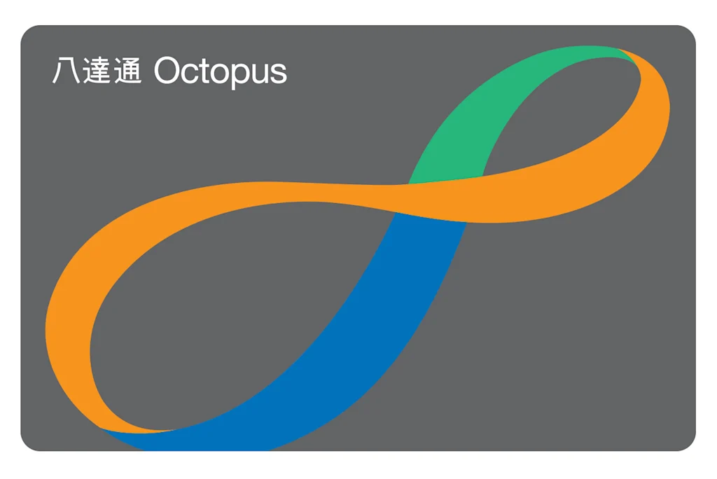
One of my favorite parts of the Octopus card? It embraces being a collectible item. Riders can customize their cards with ornaments like Pokémon keychains and plastic googly eyes from the movie Minions. This level of customization creates the perception of quality service—you wouldn’t chuck your tricked-out card in the trash next week.
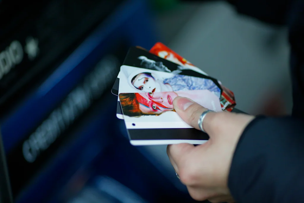
Over the years, MetroCard riders would receive special cards, but the design was a half-measure: a partial print on the back of the card. It looked like an ad. These cards featured a range of icons, from artist Barbara Kruger to baseball player Jackie Robinson to musician Olivia Rodrigo. For a plastic card that was often reissued, the MTA could’ve treated each of these heavy-hitters to a full redesign of the card. Other countries do it.
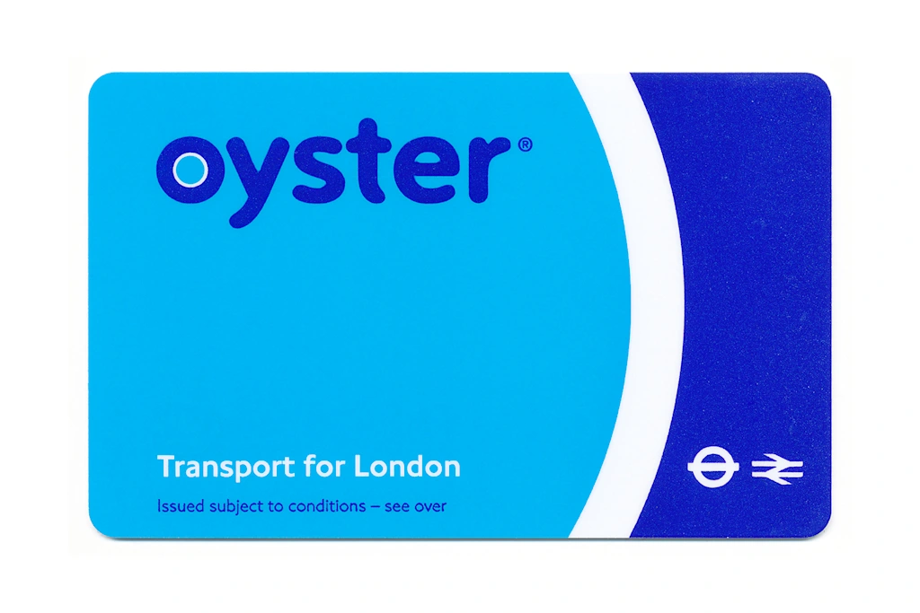
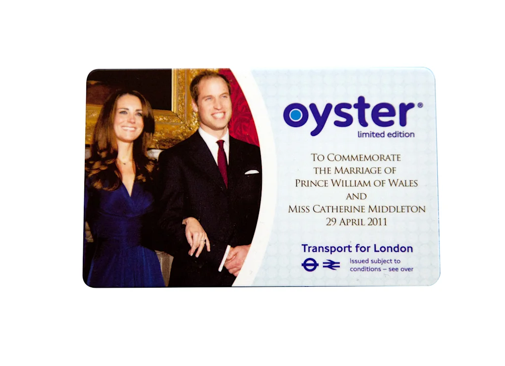
London’s transit card, the Oyster, will occasionally trade in its signature two-tone blue for a special design on the front of the card. They’ve celebrated the royal wedding of William and Kate, the Queen’s Diamond Jubilee, the 150th anniversary of the Underground, and even the 20th anniversary of the Oyster card itself, which debuted in 2003. These designs aren’t anything to write home about, but at least they create a shared celebratory moment for the rider.
Looking Ahead
Oyster’s parent company, Transport for London, licensed its scanning technology to the MTA for the OMNY. So far, I’ve had a solid experience with the new card. Every Thursday afternoon, I rush downtown to my office after teaching a class at School of Visual Arts in Gramercy Park. I need to catch up with three hours of missed work and meetings, and unlike my Port Authority MetroCard nightmares, the OMNY taps without a hitch. That keeps me sane.
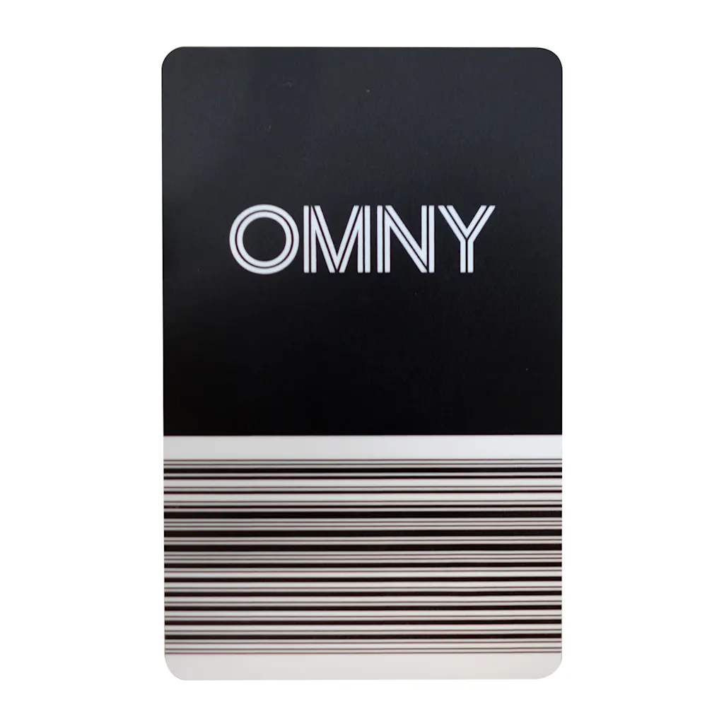
This functional experience is reflected within OMNY’s design. That black and white card is straightforward, no b.s. It uses Neue Haas Grotesk, aligning with the utilitarian typography of the MTA’s graphics system. The inline cutaway of the letters signal road lanes and railroad tracks, the barcode highlights the card’s scanning technology. This design isn’t overly dramatic like the MetroCard of yore.
But is a functional design enough for New York’s transit card of the future?
Design is culture. The comedian Kareem Rahma turns a MetroCard into the microphone for his podcast. The store OnlyNY sells MTA-licensed merch, like metal subway signs and mini-lampposts. To others, those objects are utility. To New Yorkers, they’re identity.
The OMNY card is a real opportunity to intertwine culture and design. This year, the MTA proved they truly care about design: they unveiled an animated movie by designer Giorgia Lupi, titled “A Data Love Letter to the Subway.” Their new subway map—the first update in 50 years—nods to a classic design by Massimo Vignelli. And most subway stations finally have digitized schedules with slick typography.
If the MTA continually updates the OMNY card, in print and digital form, it will become a cultural artifact. New York is full of designers with pride who’d love to create a special edition OMNY. Champions Design could give the card attitude. Collins could celebrate civic glory. Center could give it a sports flair. These special designs would create a shared moment among New Yorkers. But, those designs need to hit at the right moment.
When Zohran Mamdani takes the NYC mayoral office in January, design shouldn’t sit at the bottom of his to-do list. He’s got audacious ideas. If they go well, great design will cement the experience in our minds. A free bus that runs on time? A special-edition OMNY card would floor us with a sense of New York pride.
source https://www.fastcompany.com/91463476/mta-will-stop-selling-metrocards-good-riddance
Discover more from The Veteran-Owned Business Blog
Subscribe to get the latest posts sent to your email.

You must be logged in to post a comment.